Week 5 YouTube Music update
This week, we were tasked to update the typography style for our assigned brand as well as update the logo and overall aesthetic. This involved refining a lot of the previously learned skills into actual assets to be used in a YouTube Music ad campaign.
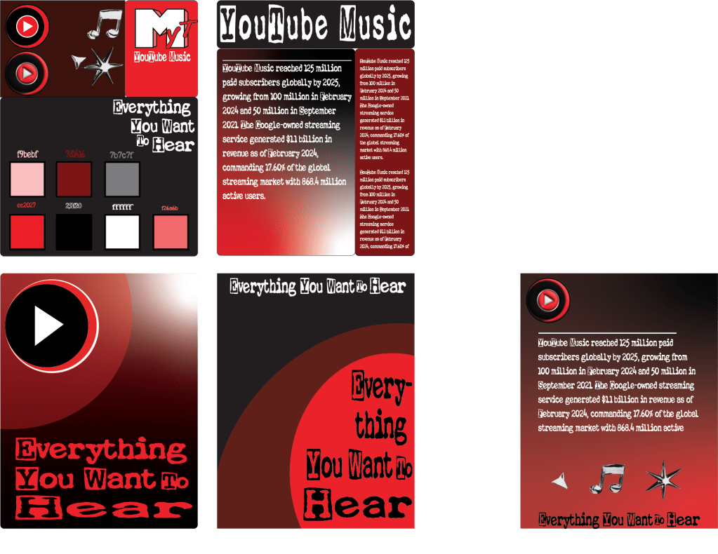
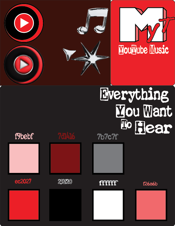
Color Palette and Assets
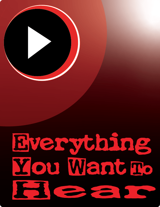
For the color palette I wanted to stick to the original colors that YouTube is known for, but change up the formula and bring out more from them. Instead of staying with the all black screen with minimal white text and a small little youtube logo at the top, I am increasing the color palette to include lighter shades of red and pink and feature more white with 3d assets incorporated into the mix. This makes for a more early 2000’s style with the overwhelming use of in your face visuals, which I think is appropriate for the create brief’s guidelines to emphasize the live visual aspects that YouTube Music has to offer over its competitors, Spotify and Apple Music.
Font Choice
For the font choice, I searched DaFont endlessly, playing with multiple different fonts turning them into 3D assets, until I finally backtracked and went with a standard 2D font labeled La Machine Company. I like how the font style came out, butI am still not sure if it was the best choice. It keeps the fun nostalgic early video rockband kind of vibe.
THE END!!!!
This part of the project was fun but I am burnt out to write any more, thanks for reading my ted talk!!!!