Visual Research &Brand Analysis
YouTube Music VS. Spotify
By Sebastian Roland
Ad Campaign Comparison and Analysis
In this blog post, I will be comparing two of the most infamous ad campaigns associated with both YouTube Music and Spotify, analyzing their unique attributes and differences in promoting their relatively similar services. I will be comparing ‘Your Favourite Artists reveal Spotify 2025 Wrapped’ (Produced by the Curly Media LTD Advertising Agency, Directed by KC Locke) from 2025 to YouTube Music’s debut, ‘YouTube Music: Open the world of music, It’s all here’ (Produced by the Industry PDX Advertising Agency) campaign from 2018. These are the most famous ad campaigns from both of these services to date. We will be measuring how truly effective they are towards their market and how their designs utilize space and attention.
Balance
Is the campaign primarily symmetrical or asymmetrical? How does visual weight feel distributed?
Spotify Wrapped:
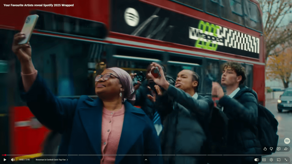
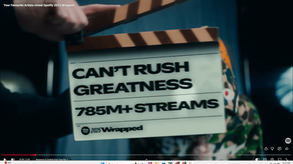
The ad is not particularly symmetrical, but it displays wording through very blatant, centered dynamic shots. For example, the wrapped logo is seen driving by on a bus moving across the top of the screen, drawing attention to it briefly before transitioning to the next scene. It holds a very satisfying sense of balance throughout the entire advertisement.
YouTube Music:
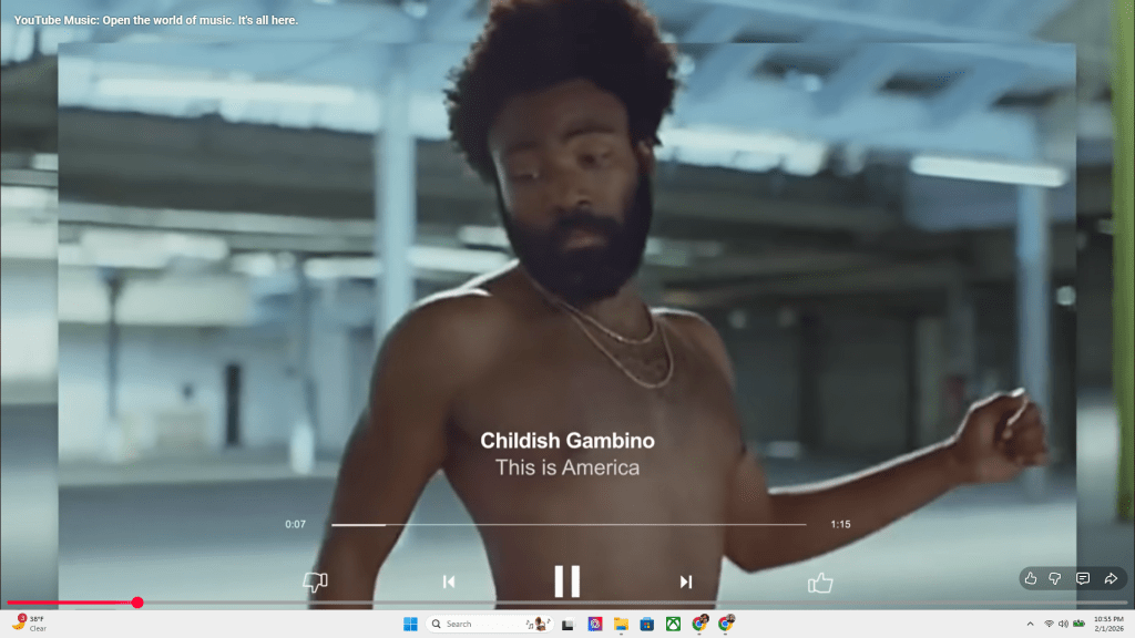
The debut ad is extremely symmetrical to a fault. The video does a good job of emphasizing the wide catalog of different music videos, but keeps the same format and style throughout. The lack of stylistic changes makes for a far more boring advertisement in comparison to the Spotify Wrapped ad. This is primarily due to the fact all of the YouTube music ad is made solely with other music videos and basic digital animations, as opposed to Spotify filming new footage with actors and artists endorsing Spotify Wrapped directly as a part of the advertisement.
Proximity
How are related elements grouped or clustered to imply meaning or hierarchy?
Spotify Wrapped:
As previously mentioned, the Spotify Wrapped advertisement uses very dynamic shots, zooming in and panning the camera to transition between different shots and text, making for a very engaging ad that constantly stimulates the viewer with content about the product or celebrity endorsements.
YouTube Music:
Proximity is used fairly well in the YouTube Music ad. It is very basic, transitioning between content showing the YouTube music platform and B-Roll of live performances and music videos. It is very direct and to the point, not really offering the viewer anything interesting to gravitate towards beyond the basic layout, which they could easily grasp by opening the website once.
Alignment
What alignment patterns or grid structures organize the layout?
Spotify Wrapped:
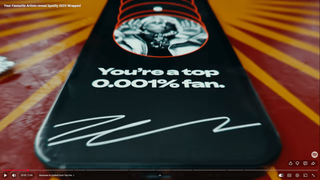
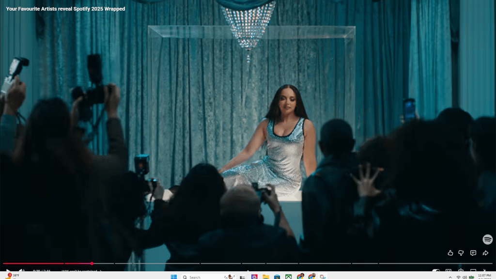
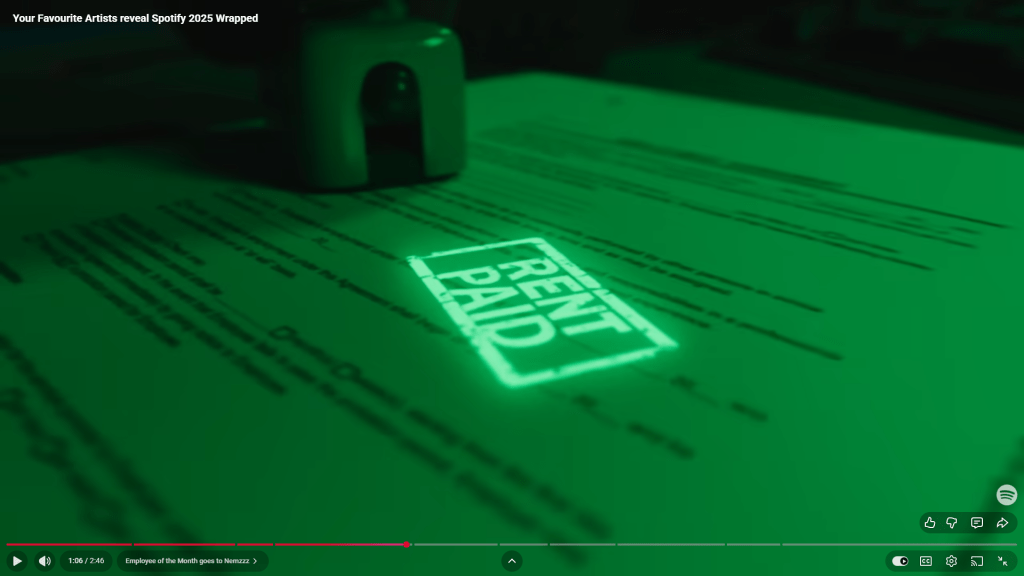
The alignment in Spotify Wrapped is extremely dynamic and never the same in any shot. Every time text is displayed, it is in a completely different context relative to what is going on in the scene, being displayed on phones, appliances, and even the back of someone’s hair at the end of the video (photo at the white-space).
YouTube Music:
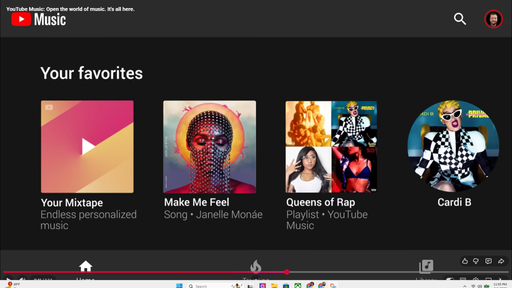
Alignment in YouTube music is adequate. When the ad begins listing its features, they are displayed on the screen in a manner that keeps the ad dynamic but accurately shows what the interface looks like across platforms- delivering a satisfactory showcase of the organized layout.
Repetition
What elements repeat to build brand consistency (type styles, shapes, color, spacing)?
Spotify Wrapped:
By far the standout feature of the Spotify Wrapped Ad that is heavily repeated is the use of celebrity endorsements to showcase the artists that people would find on their wrapped interacting with them in the advertisement itself. The ad features a lot of British Artists probably due to the advertising agency (Curly Media LTD) being based in the UK.
YouTube Music:
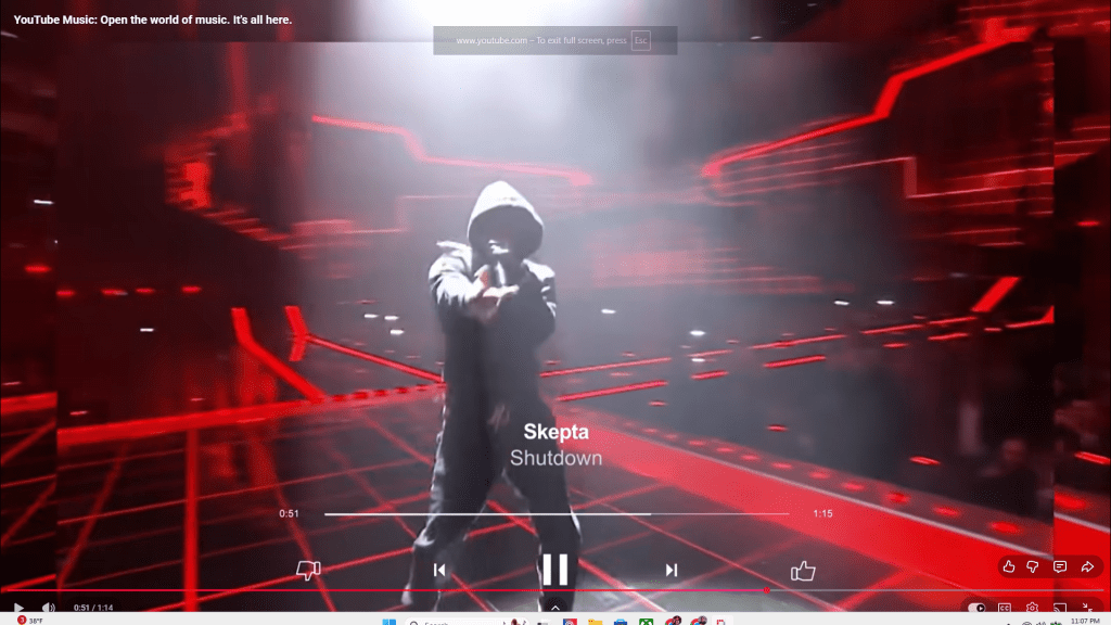
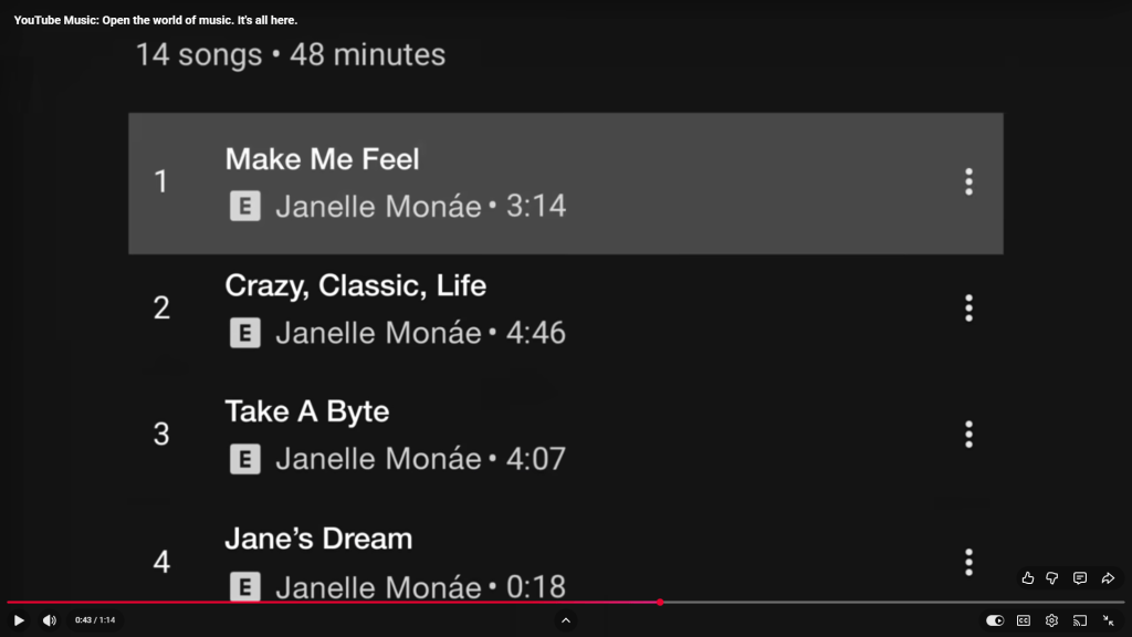
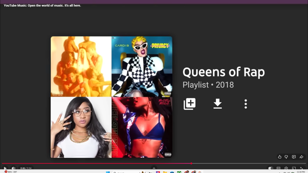
The most repeated segment from YouTube Music’s advertisement was the showcase of all the different music videos available on the platform- a feature not available on most competing streaming platforms at the time. These videos also include alternate versions of songs, including a large catalog of live performances available only on YouTube.
Contrast
Where does the design use differences in size, value, shape, or direction to create emphasis?
Spotify Wrapped:
The Spotify Wrapped ad uses a lot of contrast throughout, changing settings and context from artist to artist. Some artists are given shots that are more straightforward endorsements, while others are given more interesting skits using CGI and digital effects or elaborate costumes showcasing their streaming counts, etc.
YouTube Music:
The contrast used in YouTube Music’s ad is very basic but effective. The video jumps from showing popular music videos to some dynamic mock-ups, scrolling through different albums and playlists, directly presenting the product’s features.
White-Space
How is negative space used to isolate or emphasize content?
Spotify Wrapped:
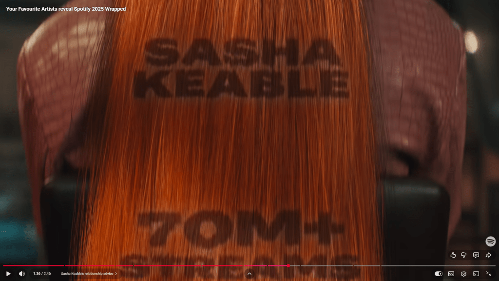
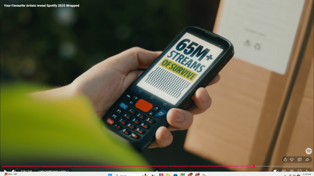
Like the rest of Spotify’s ad, the white space used in the video is exceptionally creative. The ad has a theme of placing text in very unconventional yet visually dominant places that not only captures your attention but does it in a way that is clever and relevant to the narrative playing out in the ad. For example, Sasha Keable’s scene takes place in a hair salon, talking with her friends about a popular song, before the camera transitions to her hair, where her stream count is displayed. The white space is then the back of Sasha’s hair, making for a more ridiculous and engaging shot. Other shots use comedic elements, such as a delivery driver checking his Spotify Wrapped in front of one of his favorite artists without even realizing Lewis Capaldi is standing right in front of him (last picture).
YouTube Music:
White Space is used very plainly, making the ad very basic and easy to understand. There is not much creativity behind the layout, and it presents a more functional ad showcasing the features of the ad without making much effort to innovate with the given space.
Hierarchy
How does the layout signal what is most important using size, weight, color, or position?
Spotify Wrapped:
The visual hierarchy in the Spotify Wrapped ad is very dynamic and experimental. It is probably somewhere in my top 10 ads of the past year or so. The ad transitions between text, skits, and celebrity endorsements seamlessly, making for an ad that feels next-level production-wise.
YouTube Music:
The visual hierarchy in this ad is as basic and plain as it gets. I could make an ad like this in 30 minutes easily. The video just goes through about 10-15 different music videos and live performances as B-Roll before scrolling through a couple of albums and playlists. It does the bare minimum to communicate the features of the platform, giving you a base-level experience of using YouTube Music without offering anything of substance to draw the audience in when compared to the Spotify Wrapped advertisement featuring skits and exclusive celebrity music artist appearances.
In Conclusion
Comparing these two ads, it is obvious that the Spotify Wrapped 2025 ad is far better in every way, at least in my opinion. These might not have been the best advertising campaigns to compare back-to-back, seeing as the Spotify ad probably had a far higher budget behind it
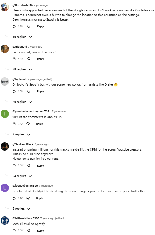
When comparing these two videos, it is clear that the higher budget and celebrity endorsements of the Spotify Wrapped ad had an immense impact in comparison to the YouTube Music ad. The YouTube Music ad had an extremely negative reception in the comments, with everyone directly calling out how their product is attempting to make already free music have a price-wall being a “worse version of Spotify.”
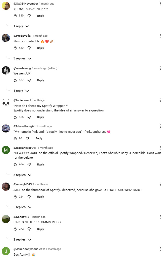
The reception to the Spotify Wrapped ad was obviously far better, with fans praising the product and celebrity endorsements featured in the video.
That is it- Hope U enjoyed my analysis 😛
